Pages

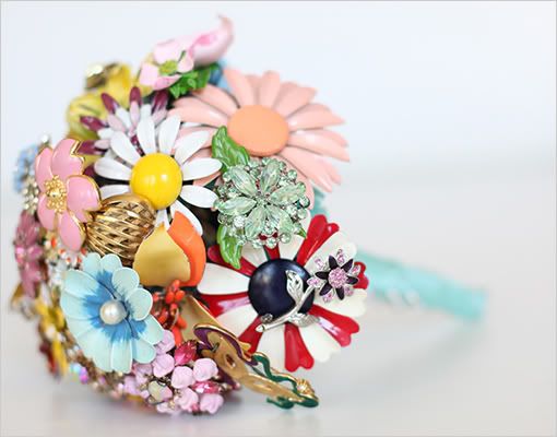
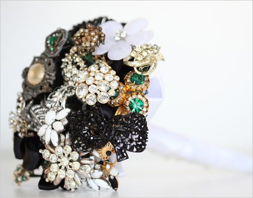
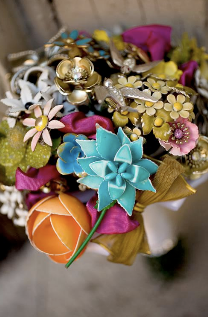
stunning vintage brooch bouquets

8.10.09

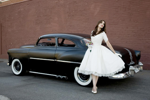
i came across this lovely blog post the other day over at the wedding chicks.  these bouquets are absolutely stunning and reminded me of the bouquet i made for our wedding last year, although these are far more stunning...


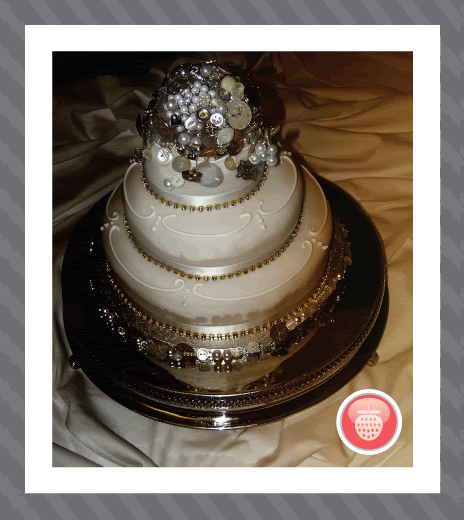
my bouquet was also made out of vintage brooches, buttons and beads and i spent months working on it. as we had our wedding reception back in the uk, i didn’t fancy holding a bouquet all night so when we got back from our honeymoon i trimmed the bouquet down and used it on the top tier of our wedding cake.


i absolutely love the idea of these brighter versions though, they would be great for a more eclectic wedding or to tie together different shades of bridesmaid dresses.  you can see more of these over at fantasy floral and they are designed by the amazingly talented amanda heer.


they are so beautiful i want them all!  the styling on this image is just exquisite...


Stumble Upon Toolbar

my wedding invitations

7.10.09

so... somewhere between last january and october my brain fell out...

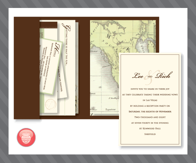
we were organising our wedding and i designed lots of lovely elements for the wedding (which was at the bellagio in las vegas) and the reception party (which was held back in the uk).  based around the travel theme i created an invitaiton set that was based around vintage travel... i just realised the other day when i thought it would be nice to create a blog post on my wedding invitations, that i never actually took a picture or saved a sample of the invitation.  i’m sure my mum has a  copy still but it is over in the uk...

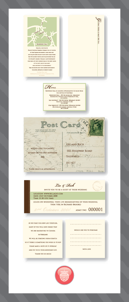
so here are some images of the invitations... not photographs so you don’t get the full loveliness but it gives you a glimpse of the theme while i try and get some actual photographic evidence that i did in fact make these.


this was the folder and how the invitation fit together.  it was tied together with green twine and a tag with the guests names on was added to the front.  i had some really good comments back from these and hardly anyone returned the rsvp cards as they wanted to keep the invitation set together and so they gave us a shop bought rsvp card!


and the whole set.  this contained a map and direction card, a local hotel guides, a rsvp card, a gift suggestion cards (as we were emigrating to canada we didn't want people to feel the need to buy us a gift) and a 'ticket' to invite people to watch our wedding live online in vegas.

... come to think of it, we don’t actually have any wedding photo’s printed either, so perhaps i should do that too!

i’m so lazy...

… i am actually married though... honest.  true it was in vegas but it is legal...

i hope!

Stumble Upon Toolbar

spring/summer 2010 | catwalk review

6.10.09

i took some time out last night to finally run through the spring/summer 2010 ready to wear catwalk collections.  there were some beautiful items, lots of lovely details and embellishments, but what surprised me most were the similarities between lots of the collections.  there are some really definite trends coming across this season. i also have a feeling that designers are not betting on the warmest of summers next year with leg warmers, socks and gloves making an appearance!  on the other hand i was surprised about the amount of leg on show, so perhaps we will need the leg warmers to keep us warm!  trousers hardly appeared in the collections at all.

these are the trends and looks that really caught my eye.


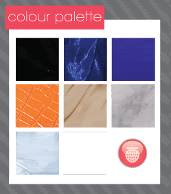
there was a very strong colour palette that led through nearly all of the catwalk shows.  Key colours were black, grey, nude, blue (ranging from bright to baby blue) turquoise and orange.  orange was the most used accent colour across all of the shows and didn’t surprise me too much as coral was such a hit last year, it was a natural progression.  there was also the occasional glimpse of red which i feel will make it’s way into a/w 2010 collections.

these are the 6 main styles i picked up on...


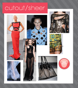
whether it was a see-through top, skirt or socks, sheer was a key element of the collections.  cut-away pieces also enhanced this look and were seen on casual tops right through to red carpet glamour.


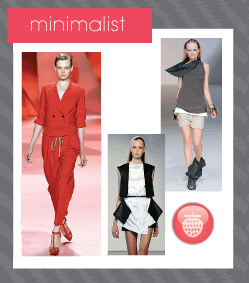
seen mainly on office wear looks, suits were cleanly cut and monotone giving out a sophisticated, elegant feel.


draping fabric was by far the most used element on the catwalks.  ranging from cowl neck tops, to layered draping dresses even to the occasional harem pant – the key to this look is using lots and lots of soft, flowing fabric.


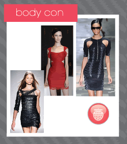
a beautiful look, body con was featured in almost every designer’s collection.  a very strong, striking look that is less 80’s in styling than we have witnessed so far.  it will have all of us toning up at the gym in preparation for the summer months!


normally reserved for autumn/winter collections, the gothic look was very apparent on the spring/summer catwalks.  leather accessories, gloves, belts were teamed with leather skirts and jackets to give of a very strong look.  teamed with bold eye shadow and embellished graphic prints this look will be key next year.


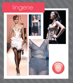
this look is probably the most publicized look i have read about.  it has renewed the look famed by designers nearly 20 years ago where corsetry and an lingerie look was designed to be worn on the high street.  i’m sure this look isn’t for everyone, but it can be toned down, maybe a beautiful camisole top can be worn underneath a long cardigan so you just get a tiny glimpse of the lingerie look.  a very sexy, romantic trend.


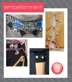
bows, diamantes, beads and fringing all were key embellishments in this years collections.


there was so many graphic prints on show this season ranging from vibrant, eye-catching patterns to more minimalist monotone stripes. 


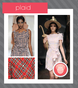
plaid played a key part in the s/s 10 collections forming the basis of casual wear – a trend that is continuing on from a/w 09


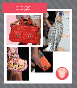
there was not too many surprises with bags this year.  they ranged from the standard hobo to clutch bags and everything in-between.  nearly all of the bags were made from leather.


the shoes displayed on the catwalks surprised me greatly.  maybe it’s another sign of the ever-changing weather but there was a lot of peep-toe ankle boots on show.  platforms had ankle straps and stilettos were replaced with a much chunkier heel.  s/s 10 also showed us different accessories to wear with our shoes - sheer ankle socks and over the knee leg warmers made an appearance from a few designers and looked great teamed with the short, short skirts on show.  the clear heel also made quite a few appearances, but that is the first and last time we will mention that (eww... horrible!)


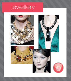
jewellery was chunky and bold and was used to add decorative elements to otherwise plain pieces.
all in all some very nice pieces were shown.  nothing too surprising or shocking but this means there are definitely some very wearable looks for us to wear in spring/summer 2010.  my tips are to start the waxing early for the short skirts and start the gym workouts now for all the body con pieces.  i know that’s what i’ll be doing!

all images taken from style.com


Stumble Upon Toolbar

breast cancer awareness month | download and support

5.10.09

i have a very special freebie to give away for you today, but on one condition...

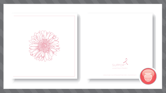
i only ask that if you choose to download this notelet, you please make a donation to the canadian breast cancer foundation... follow this link to do so.


for every person that downloads the notelet i will make a donation to the candian breast cancer foundation too... together we can make a difference.

please take the time to help, you can reach the download here.

thanks so much.

Stumble Upon Toolbar

next purchase - winter is around the corner

4.10.09

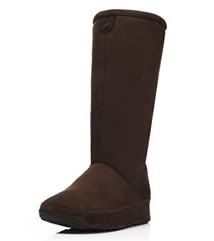
i thought i would share my next purchase with you... it was actually my hubby who spotted these as we were walking down barrington street in halifax, he grabbed me and said you're going to love these! he knows me so well.
anyone who knows me will know of my obsession with anything that promotes fitness during everyday tasks (mbt's fit flops, etc)... so when fit flops came out i had to be one of the first to get them. i remember the only place i could get them at first was in harrods in the uk. on a day trip to london i knew i had to buy them but the thing that disappointed me most was that it was the middle of winter. now i know the winters aren't that bad in the uk but it's not flip flop weather. actually all in all you probably only get around two flip flop wearing weeks a year in the uk, the rest of the year being miserable and damp. sorry if i offend any fellow brits but you all know it's true!

anyway, back to the boots... here's another picture to bring me back onto the subject.


i love these but i'm not sure if i would wear them

now this is a marvelous idea, and i'm certain i would get much more wear out of these. another thing that annoys me with flip flops is that the toe posts irratate me after a while. the only thing that freaks me out a little is that they are designed for you to wear them with no socks on. i've tried this with my ugg boots and i'm not overly keen.

i'm going to have the tightest buns in halifax this winter when i buy these!

Stumble Upon Toolbar

halloween glamour | freebie!

here is a freebie download! a note card in the halloween glamour theme. i decided to do a notelet as it is something that can be used all year round and it isn't too obvious that it's a halloween card.


download the pdf here.

Stumble Upon Toolbar

halloween glamour | the stationary set

3.10.09

so here we have it! the stationary set for my halloween glamour party. it is simple and sophisticated and will tie in perfectly with the table plan that i posted earlier. lets take a look at the elements...

the invitation
the main part of the set and the first glimpse your guests will have of the theme...


the invitation itself is very simple, ideally printed on a slightly textured thick white uncoated card stock. the reverse of the invitation is made up of a pattern using the main colours from the colour scheme. i decided on the black cat motif because cats are very elegant creatures and the black cat is one of the first things that comes to mind when you think about halloween.

as an added element, the invitation can be slipped into a card jacket with a little die cut section so you can see the cat and the invitation header. this looks beautiful with an orange satin bow tied around the centre.


the menu
for the menu piece (the piece that i showed on the earlier post here) i wanted to carry on the look and feel of the set. this piece features a tiny cat resting in the 2nd 'o' of october. this would be a gate fold card with a die cut window as on the invitation. this could also be tied together with an orange satin ribbon or placed on top of the napkin and tied together with the ribbon.


the place card
this simple piece could be a flat piece of card (like a business card) or it could be made into a standing tent card. with any name i would try and find some part that the cat can 'hold' onto.


if you would like any part of this stationary set, then please contact me. i can personalise the set for you too.

the font used in this set is quicksand and is available here.

freebie stationary item coming tomorrow!

Stumble Upon Toolbar
 
Follow Me on Twitter